9 creative trends for fonts for 2020
The last year of the decade is coming to an end, and it's safe to say that font trends are a new and bold era of design. While some designers use innovative font technology, others use the experience of the past to resurrect and reshape the trends of the modern world. This interaction between the past and the future creates some contrast and many exciting trends.
One of the most intricate features of fonts is that the leading positions among them in the world of design and graphics often change. Designers should be aware of how certain fonts are evolving and what trends are approaching. Here are some of the highlights of 2020 Typography and tips on how to use them.
1. Humanizing serifs
.png)
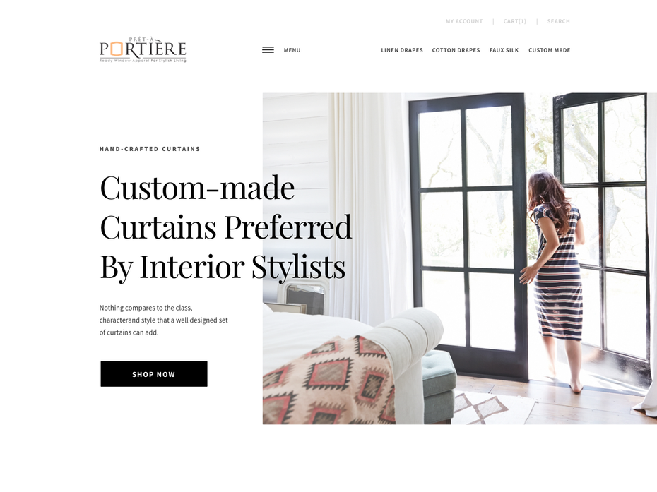
In our digital age, designers often gravitate to using serif fonts because they have always been considered more "modern". But we do see a prominent set of brands that use bold, high-contrast, serif fonts in their logos and websites. This is likely to be the leading trend in 2020. Reason? Serif fonts are great for storytelling. They convey a certain nostalgia because they seem to bring us back to a time when the world was not so digital. All of these associations have a profoundly humanized effect on the brands that use them.
2. Round san serifs
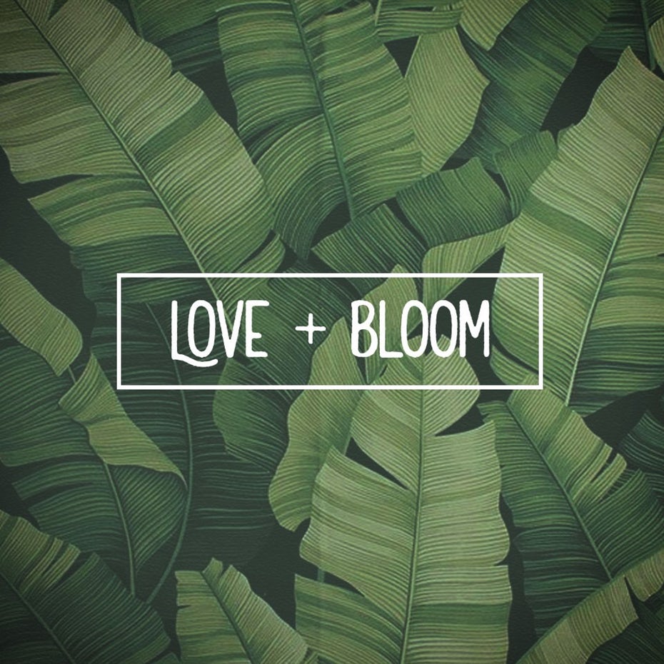
Trends for Sans Serif in 2020 indicate clarity and roundness. The move towards friendly geometry is present in the logos of several well-known brands such as AirBnB, Google and Spotify. Although serif fonts may look a bit childish, these fonts convey simplicity and straightforwardness. The Cuppa logo is a great example of branding that conveys both seriousness and a welcoming atmosphere. These Sans Serif are often combined with a bold and playful color palette. They are ideal for a business that wants to inspire confidence and positivity.
3. Swiss style typography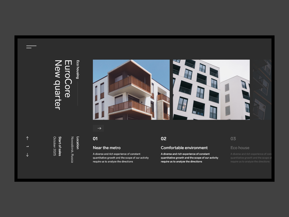
Type designers around the world are trying to reimagine the well-known international typographic style for the digital age. The Swiss style is a design movement formed from several iconic designers who worked in Switzerland in the middle of the century. This style is determined by readability, simplicity and objectivity.
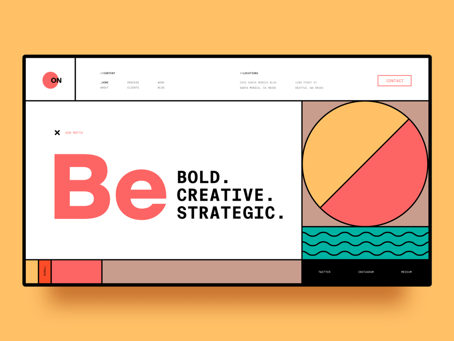
Although the style was refined and designed more for printing (on posters, book covers, pamphlets and other printed outposts), it proved to be incredibly adaptive to our modern day. This adherence to grid-based designs with clear, unusual sans-serif fonts creates a natural hierarchy and exists well in digital spaces.
4. Rustic fonts

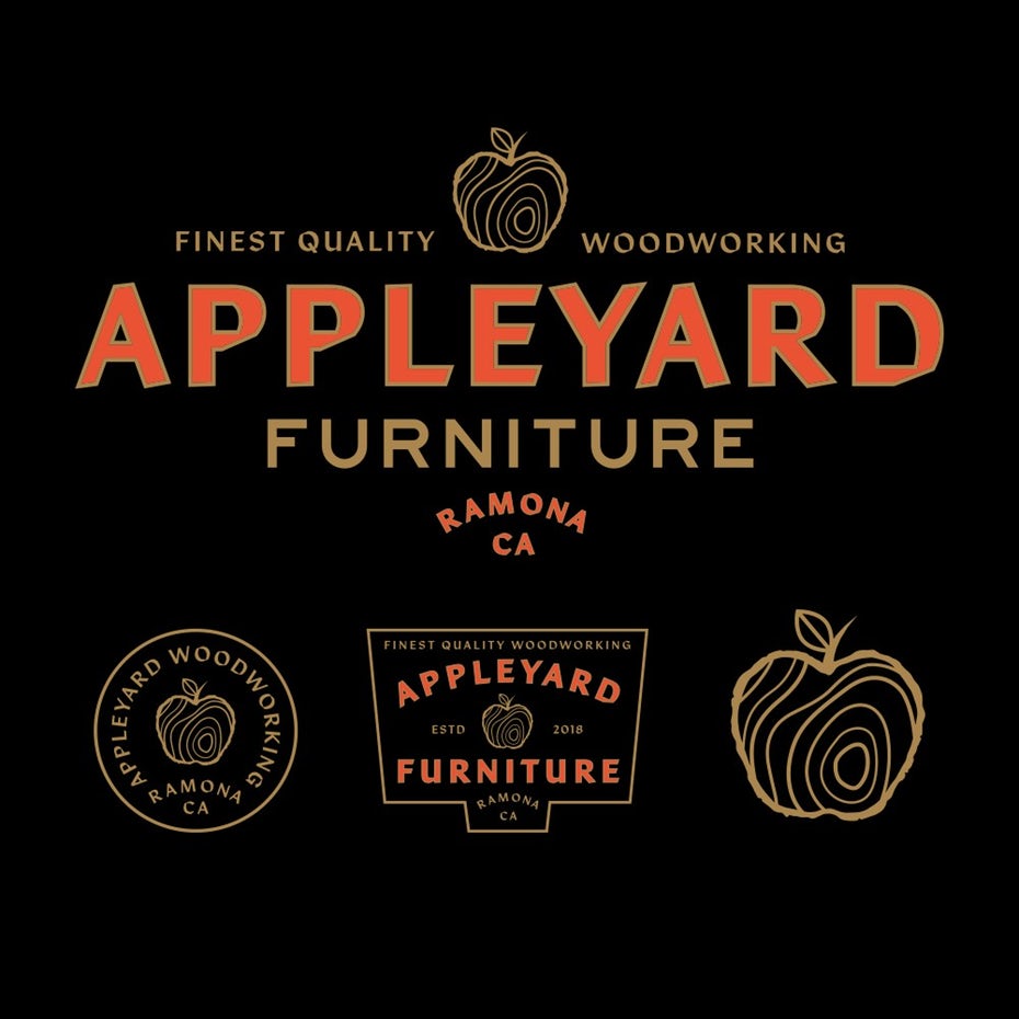
In the last few years, handwriting fonts have been very popular. New rustic fonts are often found in branding for breweries, farms, bakeries and other traditional industries. Although the font on the Gold Country Renovations logo seems familiar, its extremely wide Tuscan fonts make it fresh and authentic, and its linear weight is perfectly matched with its own logo illustration.
5. Wide open minimalism

Many designers experiment with negative space and remove transverse letter shapes to create more advanced shapes. Despite the minimalistic nature of this approach, it helps to strengthen the font and enhance the sense of importance of each letter. The resulting font becomes both airy and massive. If done correctly, such fonts can make the viewer feel that he or she is solving the puzzle. These letterhead designs, sleek and open - invite the viewer to experience endless possibilities.
6. Classical influence
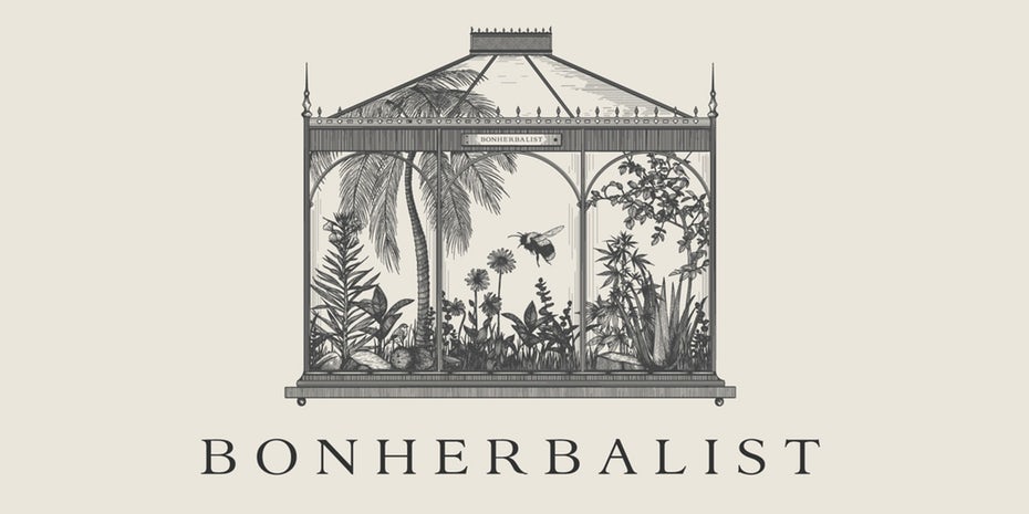
In the design of logos, a noticeable return to more classic fonts. These delicate and sophisticated fonts are used to radiate warmth and luxury. They look incredibly fresh because of their lack of effectiveness and integrate perfectly into the illustrated logos. In contrast to the popularity of heavy serif fonts and bombastic fonts, this trend asks us to enjoy a moment of quiet calm. Often classic fonts are used in botanical compositions that seem to be drawn directly from the beauty of nature.
7. Pixel art fonts
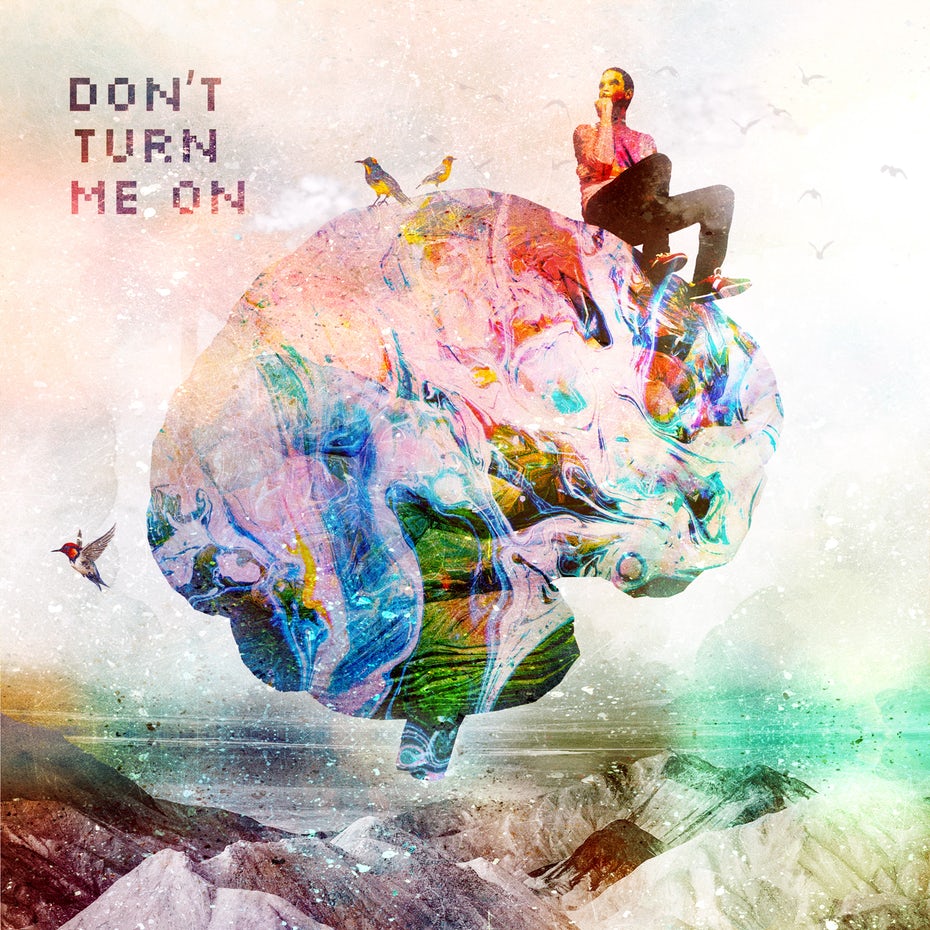
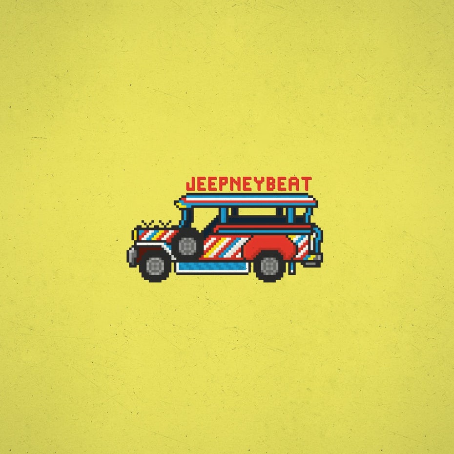
Pixel art evolved from two-dimensional computer graphics of the 70's to the 90's, and now, in 2020, pixel-style fonts are regaining their popularity. . We now see pixel art fonts appearing in bar and truck logos, as well as in poster and packaging designs. And it's easy to see why: For generations of people who enjoy video games, 8-bit design evokes an association of joy and fun, freedom and opportunity. Who doesn't want more of these feelings nowadays?
8. Seventies and eighties fonts
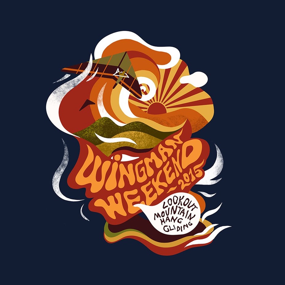
It may have started with the credits for Stranger Things: as soon as the ITC Benguiat font was revived, a Pandora's box of the late seventies and eighties was opened. This retro trend goes beyond the expected kitsch, neon characters. Instead, he dives deep into the souvenir gothic and the type of the Lyubalin Coat of Arms (which created period period fonts) to create truly favorable and folding designs. This tendency works especially well for the younger crowd, who were born much later in the eighties, as they see these fonts with completely new eyes.
9. Kinetic fonts
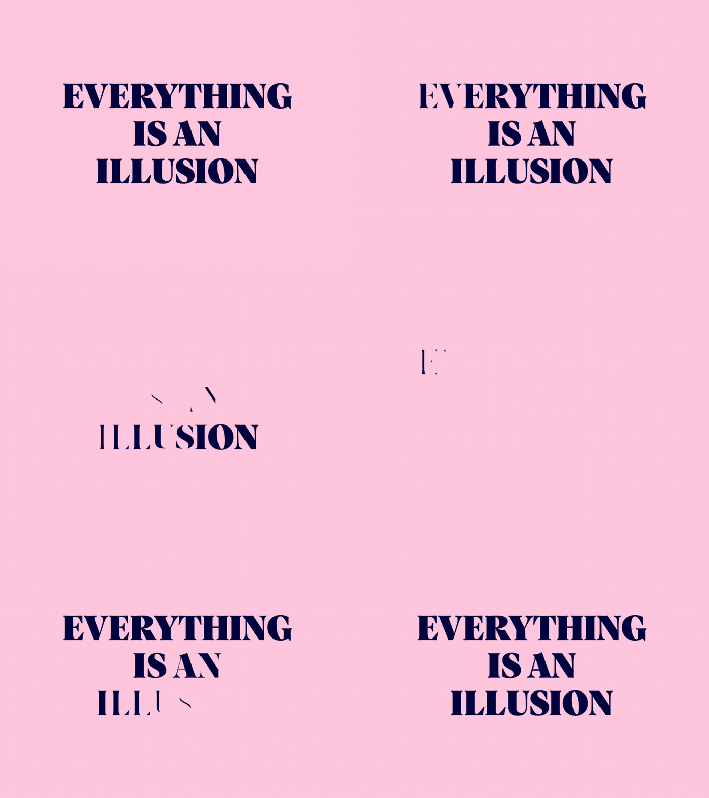
Kinetic typography is a fanciful way to show "moving style". It combines old-fashioned typography with the power of video and animation to create truly eye-catching, unforgettable designs. A designer working with kinetic fonts should consider style and effects, not just conventional considerations such as alignment, weight, and hierarchy.
It is clear that 2020 will be interesting for font trends. From amazing, mid-century serif fonts to kinetic animated fonts, from minimalism to sophisticated vintage styles. Designers come up with ways to use past trends to make fresh designs.
Source link: https://99designs.com/blog/trends/font-trends/

