Why abandon the sticky navigation bar?
The use of sticky web elements should be abandoned. Researchers have noticed that it creates a terrible impression on users and from the point of view of the interface does not look attractive enough. These elements also take up valuable screen space.
The concept of "sticky elements" includes, but is not limited to, the following elements:
- the navigation elements that follow the user when scrolling;
- bubbles of chatbots occupying half the bottom of the screen;
- banners or modal windows that prompt the user to "sign up, accept cookies", etc.
These items should not be used. The location of the elements and layout is an important part of the product design and strongly influence the user experience. Therefore, anything that complicates the work of the user with the site should either be abandoned or minimized in use. Of course, if you want more and more visitors to your site.
Now it is necessary to deal with "sticky" navigation and why it is so terrible. We will also look at an alternative that will help you avoid making such bad design decisions.
Pursuing navigation
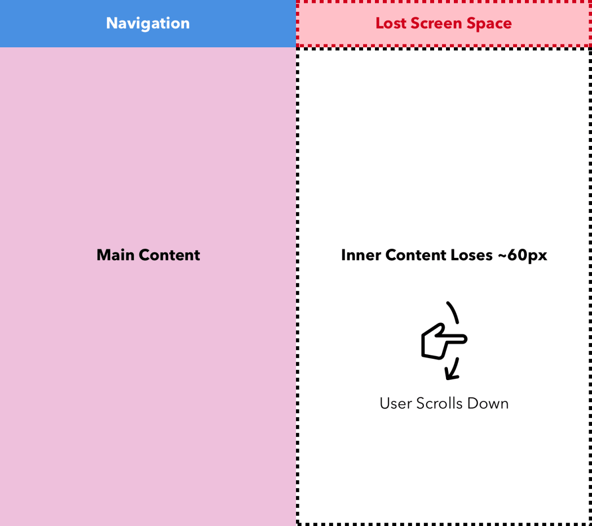
If you choose to use more than 50px of space at the top of the page to navigate the site, you will harm your users and thus spend their time interacting with your site.
Sticky navigation advocates would now shout, “Hold on! This panel allows the user to easily interact with the site pages! ”.
It's a complete loophole. The user should only see the site navigation when they need to use it.
It should be familiar with the problem:

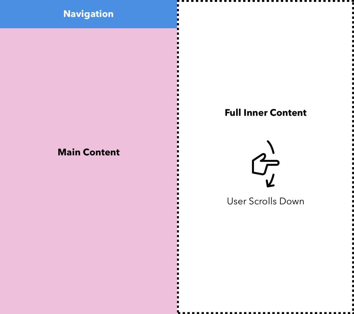
To know when to show the navigation bar you just need to understand the user context at a certain point in time. See below:

This is where the navigation bar moves up to the rest of the page when the user scrolls through the main content. No need to worry, the user knows that the navigation is at the top of the page because he has seen it disappear from view when scrolling. This option is best combined with proper foot navigation. That way, when the user reaches the end of the page, he or she can navigate to other pages directly in the footer. No need to scroll back up the page.
Alternative
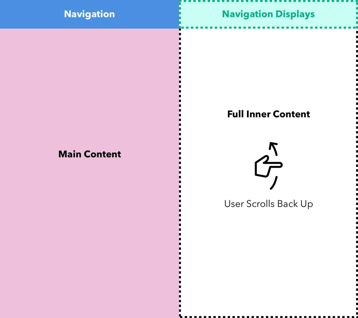
It may be that you want to hide the navigation without losing flexibility and always be accessible at the top of the page. This is feasible, although some developers consider this option to be slightly intrusive to users. An easy way to do this is to show navigation when users take action, such as:
- long or multiple swipes up
- opening the drop-down menu (easily visible to the user)

We do not use “sticky” elements on our site and do not advise others. If you need a really attractive interface and a user-friendly site (application, management system), contact us and we will try to implement all your wishes as high quality and fast as possible.
Source link: https://ux.pub/prekratite-ispolzovat-lipkuyu-sticky-panel-navigatsii-dlya-mobilnyh-ustroystv/


