Color of the year: retrospective 2009 – 2019
Every year new color trends appear, and it is not always clear why one or another shade of pink, green, yellow, and so on became relevant. The development of such tendencies is addressed by whole color institutions, who thoroughly study the mood of society, the patterns and the popularity of past trends. Every year, the Pantone Color Institute, based on the above and other criteria, selects the color that will become the most relevant. Therefore, a small retrospective of the color trends of the last 10 years will be very interesting and useful.
2009 - Mimoza
PANTONE: 14-0848 HEX: #EFC050 RGB: 239 192 80
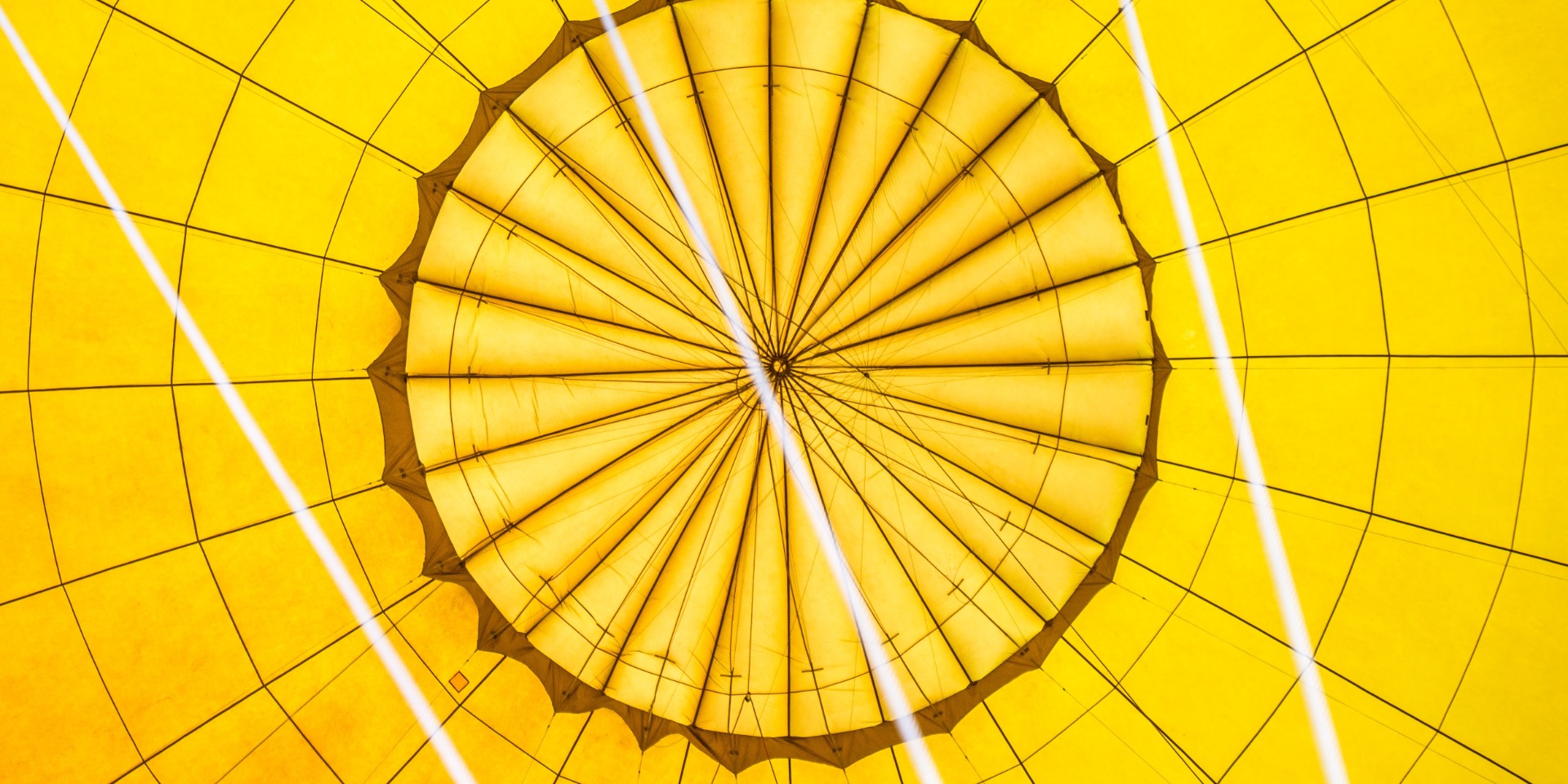
According to experts from Pantone, during periods of economic uncertainty and political change optimism is paramount, and no other color expresses hope and assurance more than yellow. This color is an example of warmth and confidence, enlightenment and prosperity. Mimosa is a versatile shade that combines with any other color. It is attractive for men and women, used in fashion collections and interior.

2010 - Turquoise
PANTONE: 15-5519 HEX: #45B8AC RGB: 68 184 172
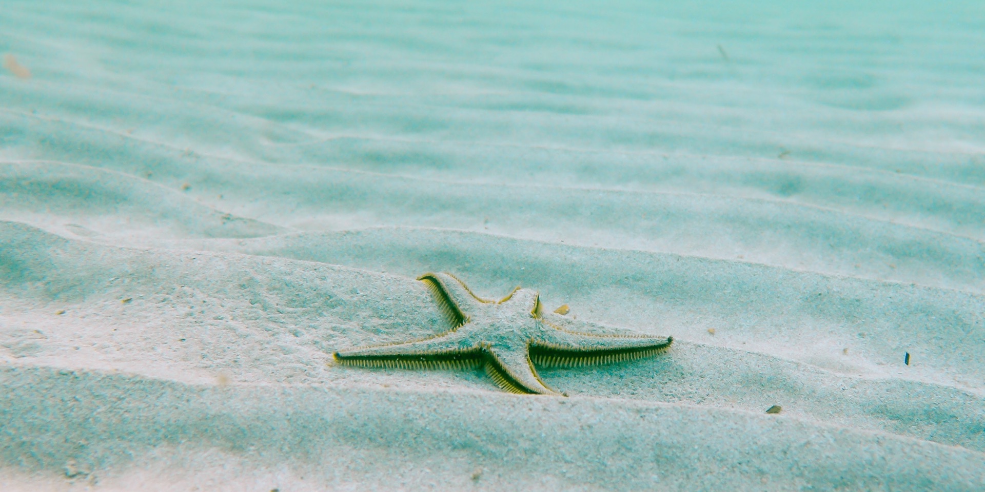
In many cultures, turquoise is considered a protective mascot, a color of deep sympathy and healing, faith and truth, water and sky. Through many years of color association research, it has been discovered that for most people, this shade is a symbol of escape from worries and problems. Regardless of whether people associate it with the calm ocean surrounding the tropical island, or with a protective stone that protects against evil spirits, turquoise is the color that most people react positively. It is universally enjoyable, perfectly combined with neutral and brown colors, enlivens all other green shades, and looks especially beautiful in combination with a yellow-green palette.

2011 - Honeysuckle
PANTONE: 18-2120 HEX: #D65076 RGB: 214 80 118
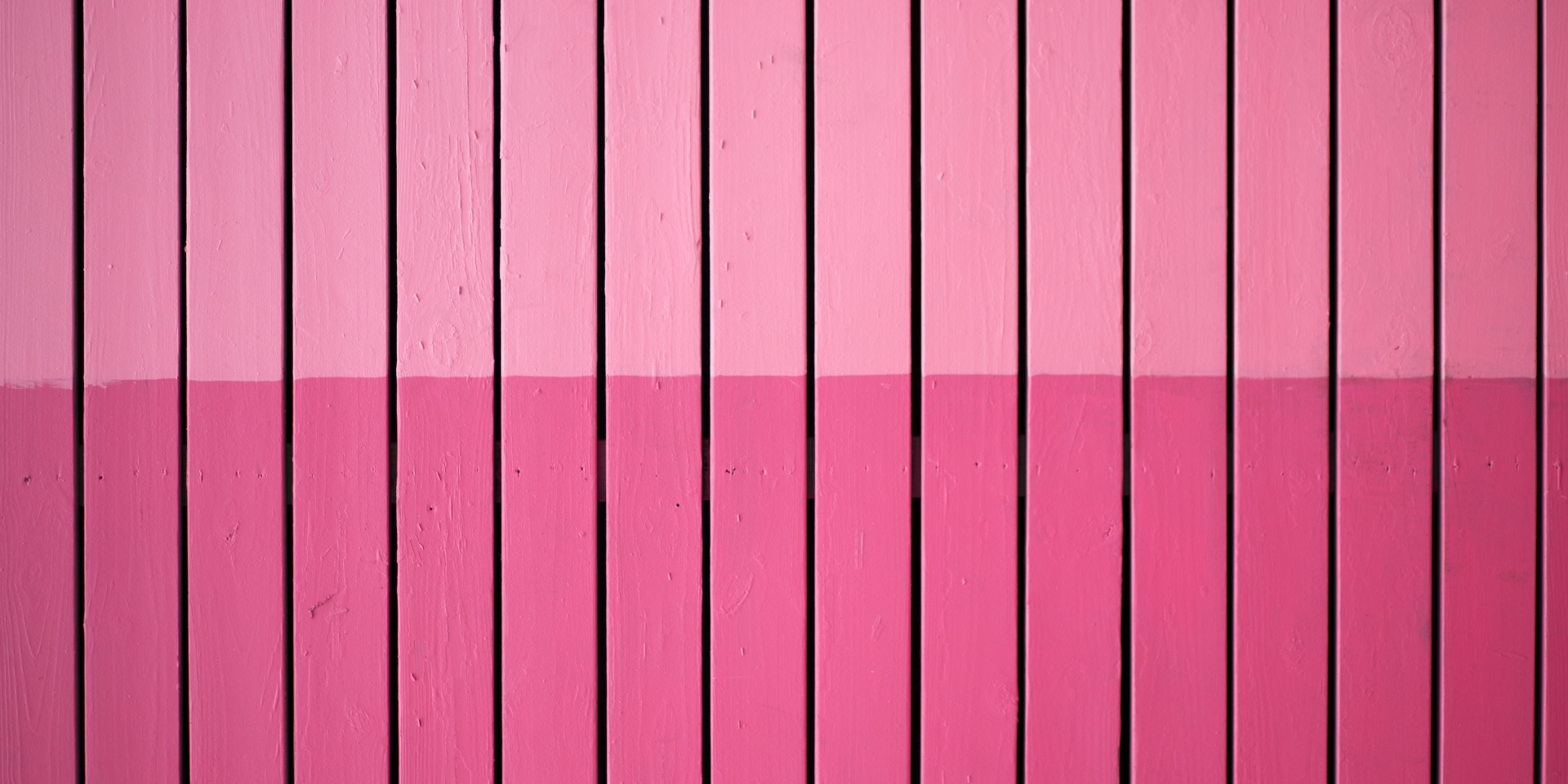
A bold new color for a courageous new world. It is a color for every day, but without burdensome "everyday". Dynamic reddish-pink color encourages and raises the mood, instilling confidence and courage to solve everyday problems. This impressive and attractive shade looks beautiful during the day and in women's clothes, accessories and cosmetics, as well as men's ties, shirts and sportswear.

2012 - Tangerine Tango
PANTONE: 17-1463 HEX: #DD4124 RGB: 221 65 36
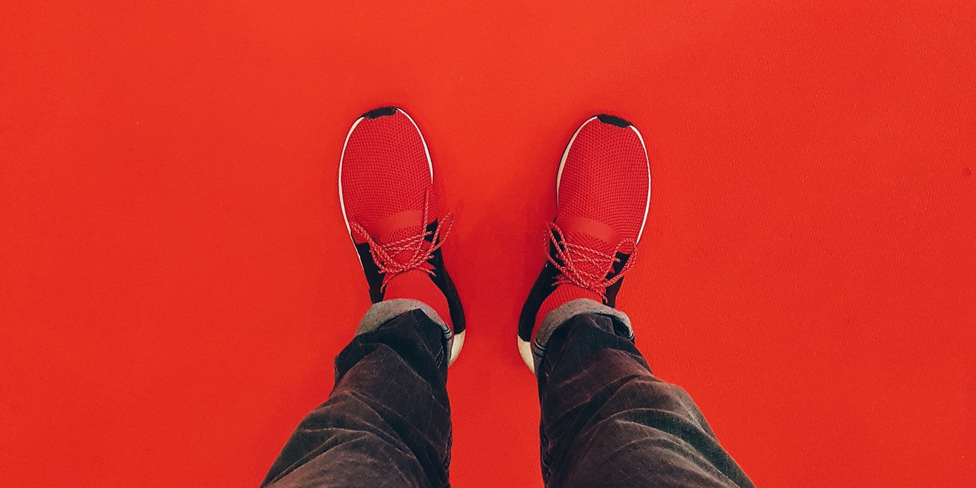
The Tangerine Tango is a vibrant reddish-orange color that provides an energy boost that is so essential for development and forward movement. Sophisticated, but at the same time dramatic and seductive color, reminds of the shining sunset. The combination of adrenaline red and warmth of yellow forms a pulling tint that emits heat and energy. This color was very popular in the spring-summer collections of 2012 and has come to the liking of designers and genuine fashionistas.

2013 - Emerald
PANTONE: 17-5641 HEX: #009B77 RGB: 0 152 116
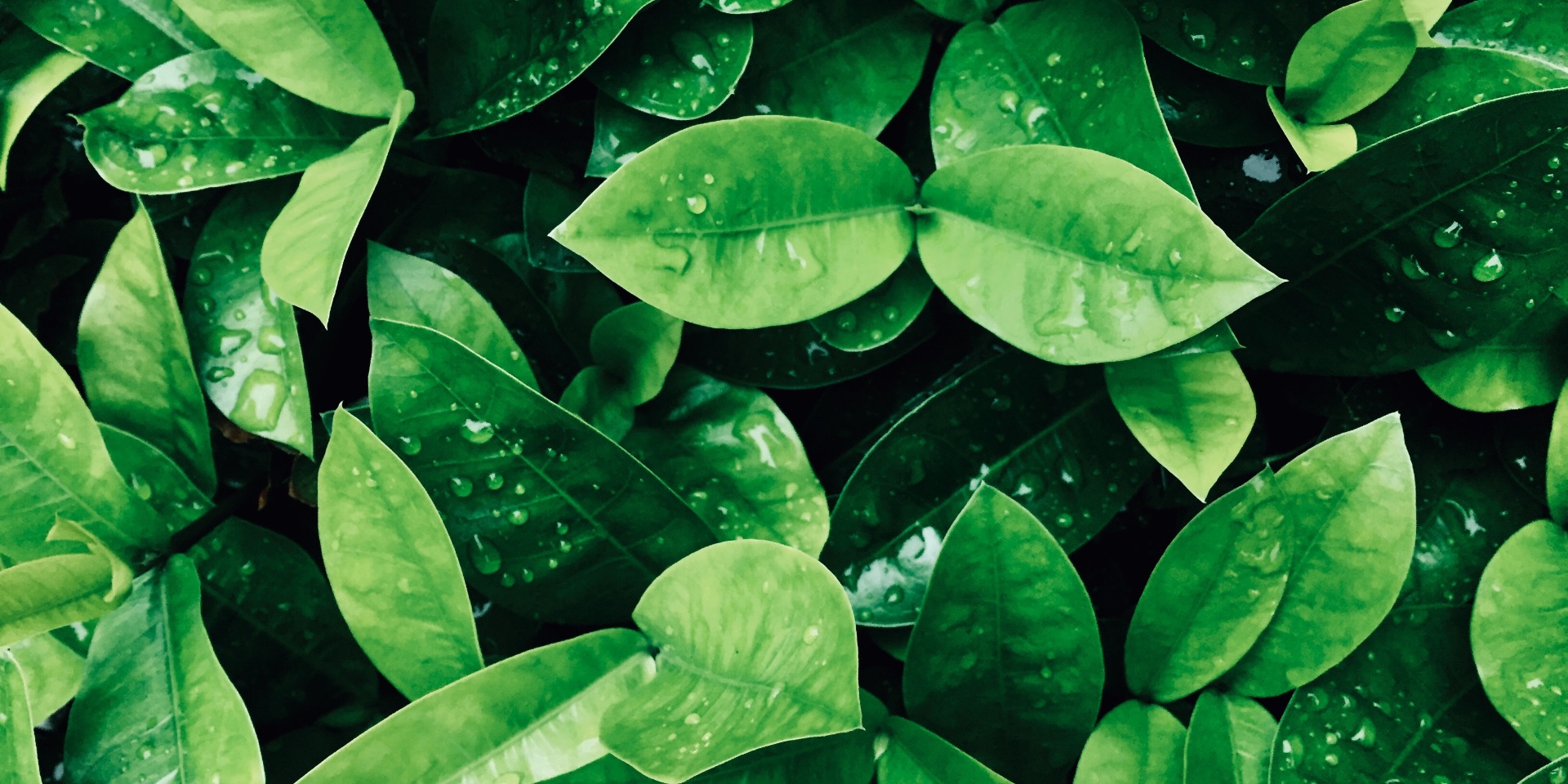
Bright green color, which further strengthens the sense of well-being, promotes balance and harmony. Most often associated with brilliant, precious stones. From time immemorial, this bright shade was a color of beauty and a new life in many cultures and religions. In addition, no other color transmits regeneration and updating is better than green. That is why for many centuries many countries have chosen green as a symbol of healing and unity. As before, the versatile Emerald continues to shine and enchant real connoisseurs.

2014 - Radiant Orchid
PANTONE: 18-3224 HEX: #AD5E99 RGB: 173 94 153
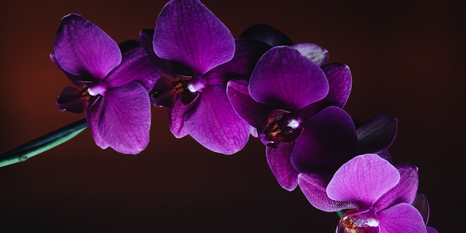
Radiant orchid blossoms with confidence and magical warmth, intriguing eye and arousing imagination. It is a distinctive and creative violet color that attracts its charm. Combining the harmony of fuchsia, purple and pink shades, Radiant Orchid emits great joy and love. This color extends the imagination and originality, which is increasingly valued in modern society.

2015 - Introducing Marsala
PANTONE: 18-1438 HEX: #AD655F RGB: 150 79 76
Muffled burgundy with a brown tinge - so define Marsal color specialists. He is thick, rich, dark, does not catch his eye, calm. This shade is really similar to the strong wine of the same name, from Sicily: just as expensive, deep, not subject to the one-syllable description. At the same time, Marsala, as one of the tones of burgundy, possesses a certain softness and warmth, which gives him a brown note. At the same time, the overall temperature of the Marsala color is neutral: it combines well with both warm and cold colors. In terms of psychology, Marsala is a mysterious color, a mystery. Marsala is devoid of sight, which is inherent in pure shades, but she is coated with black, and not white, therefore generates associations with inner maturity and hidden passion. No degree of tenderness and innocence - only just self-confidence and readiness for change.

2016 - Rose Quartz & Serenity
PANTONE: 13-1520 & PANTONE: 15-3919 HEX: #F7CAC9 & HEX: #92A8D1 RGB: 247 202 201 & RGB: 146 168 209
For the first time, the Pantone Color Institute named the color of the year as the main tint of the year, but a duo. In 2016, designers, makeup artists, stylists and, of course, fashionistas paid attention to the harmonious combination of cool blue (the shade of Serenity - serenity, heavenly blue, calm blue) and warm pink (the shade of Rose quartz - pink quartz). The colorists decided that the world was tired and wanted to relax. The favorites of the past years are more suitable for noisy parties and red tracks, while this couple from the gentle shades of pink and blue - for walks by the sea, a relaxing holiday. This combination has become quite successful for the wedding. A soothing combination of shades of "pink quartz" and "serenity", meanwhile, requires caution, because when used improperly, it can easily make an unplanned old-fashioned image.

2017 - Greenery
PANTONE: 15-0343 HEX: #88B04B RGB: 136 176 75
A refreshing and revitalizing tint, Greenery is a symbol of a new beginning. Greenery is a fresh and lush yellow-green shade that creates a feeling of the first spring days when the natural greens revive and rejuvenate. The more a person is immersed in modern life, the less becomes her innate desire to plunge into the physical beauty and unity of the natural world. The joyous greenery is also a symbol of a desire for personal passion and vitality.

2018 - ULTRA VIOLET
PANTONE: 18-3838 HEX: #5F4B8B RGB: 95 75 139
Ultra Violet suggests revealing the mysteries of space, intriguing about what waits in front and symbolizes extensions of the limits of one's own consciousness. A huge and boundless night sky symbolizes the fact that there is always a possibility of change and inspires the desire to explore the world beyond our own. The Ultra Violet depth symbolizes experimentation and discrepancy, prompting people to realize their uniqueness in this world. Historically, the ultraviolet has a certain mysticism. According to vice president of the Pantone Institute of Colors, Lori Presman, Ultra Violet is truly a reflection of what is needed today in our world.

2019 - Living Coral
PANTONE: FA7268 HEX: #5F4B8B RGB: 250 114 104
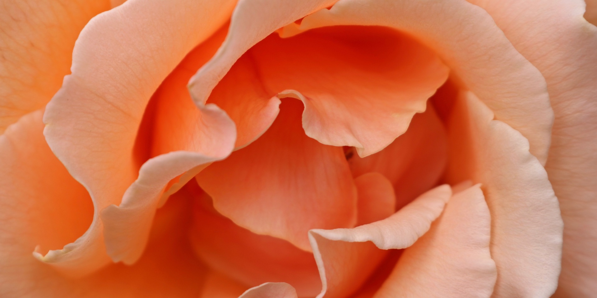
Experts decipher this color as a noble coral with a golden glow. It symbolizes the human congenital necessity of optimism. The Pantone explains that we are getting energy from nature, just as coral reef is a source of living and a sanctuary for marine life, bright, but the "soft" living coral "takes us into our warm and caring embraces that give comfort and Helping to stay afloat in our changing world. " Representatives of the institute noted that this shade is very life-affirming, warm and bright. According to the executive director of the center, Litrice Aysmen, this color can be found both in the natural environment and in social networks. "The shade that celebrates its life with its dual role of color as energetic and caring, Pantone 16-1546" living coral "once again confirms the fact that colors are able to embody our collective experience and reflect what is happening in a global culture in a certain moment of time, "says Pantone vice president Laurie Pressman.

By reviewing our projects, you can enjoy the skill of combining different shades and boldness of design solutions. Choose your favorite color and always be in trend.)
We used these color trends in Gazmeter and New Fashion
