How to choose a font
The ability to successfully complete text is one of the most important skills for a designer. The font for a designer is a tool for communicating with users. Typography can both improve the design and break it. The process of selection is a very interesting and painstaking procedure. It is important to understand the design goals, your target audience and, of course, do not forget about inspiration.
This article provides the basic principles of typography and the choice of font that you must follow if you want to create a really successful design.
1. Familiarize yourself with the types of fonts
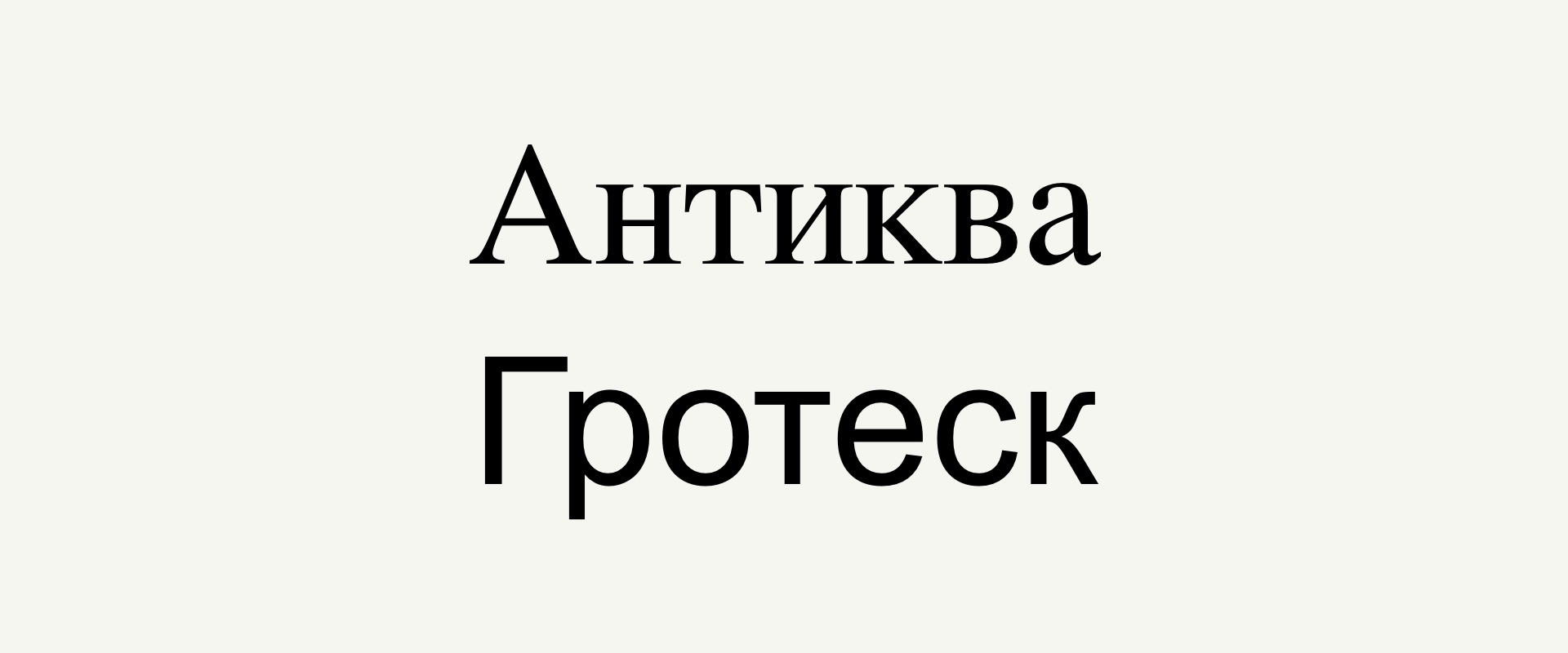
There are many different font classifications. They all contradict each other, so that they are easy to get confused. The simplest classification looks like this: there are fonts with serifs (antique), without sliced (grotesque) and all the rest. Serpents - these are small little lines on the tips of the letters.
All other can include handwritten fonts (they mimic handwriting or calligraphy), monospaced (both in typewriters or in the code editor), symbolic (icons, symbols, emotions), and accident - so-called any decorative fonts for the design of large inscriptions, headlines and logos.
2. For long texts use serif font
When you draw up any long text (article, resume, letter, instruction), it's worth using a font with serifs, that is, antique. It is believed that long text typed in this font is easier to read. In traditional made books, too, the very antique is used.

3. Use a sans serif font for short texts
Fonts without slashes, that is, grotesque, surround us everywhere - they are used on sites, in interfaces, logos, advertising, navigation, packaging, and even in books. Since the end of the XIX century, this type of fonts is associated with all modern, so if you choose the font for the logo of your new company, feel free to use the grotesque.

4. Properly combine fonts
The combination of different fonts is no less important than selecting the font itself. Thanks to a well-chosen combination of fonts, a visual hierarchy of information is created and the readability of the design improves. You can control the glance of the reader: first the title, then the main text. You can also create a visual contrast using different font sizes, colors and scales.
5. Define the font size
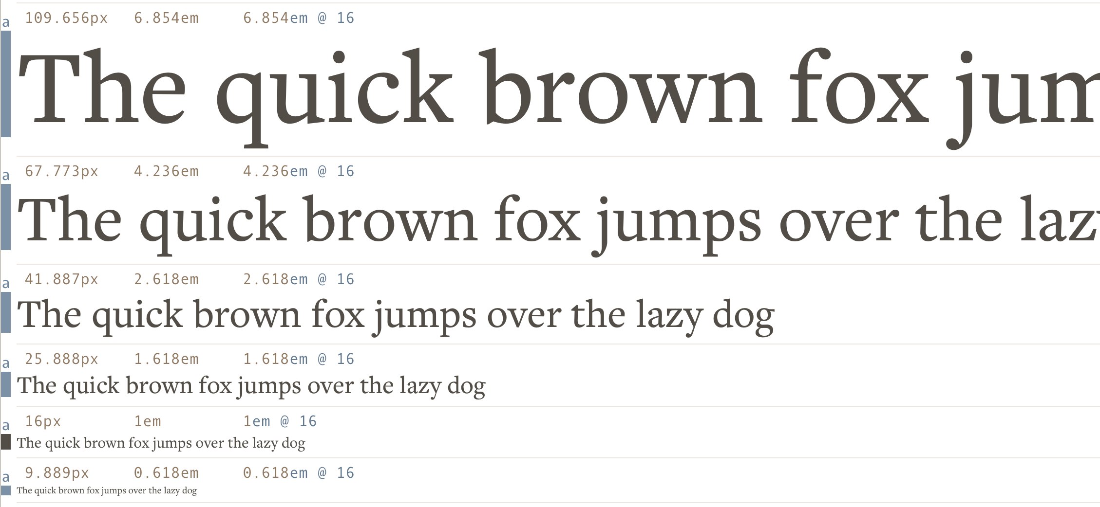
Once you've found a font combination, get the size. For this, the Modular Scale is great. In fact, Modular Scale is a system for identifying the historically formed ideal font size relationships. Modular Scale generates dimensions using mathematical formulas. However, this is just a tool. Use this method as the base, and then adjust the size to your liking.
6. Do not use many different types of fonts
No less important is the number of fonts used. You should not use more than three designs in one design. In addition, they must be compacted so that they are contrasted. The main text must be one font and size. For headers, choose a different font. Do not be afraid if the fonts are very different. After all, when using two very similar fonts in design, the reader may think that you just made a mistake and randomly chose not the font when typing.
7. It's worth downloading free fonts
It is unlikely that you will be able to do only standard fonts. Fortunately, it's easy to find a lot of free fonts on the Internet - and not pirate! This can be just a free font, a beginner's work of a font or fan, a stock in a store or a trial version.
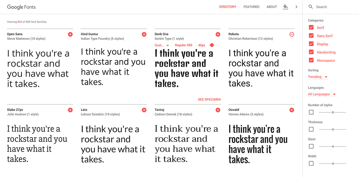
The most obvious place to look for free fonts is, of course, Google Fonts, which currently has 76 Cyrillic font families (each family includes several drawings). An obscure place to find free fonts - promotions and sales in the largest online store MyFonts, where with the help of advanced search can find more than hundred free Cyrillic sketches. You can search for free fonts in thematic communities or download trial versions on the sites of font manufacturers - though, unfortunately, this is by far not the most common practice. And be careful: not all free fonts are high-quality, and not all free fonts can be used for commercial purposes, so read the license.
8. Take into account the context of the use of the font
Each font has been made to solve a certain task, it should be taken into account when it is used. You should not use gothic signboards in a cafe with donuts, and the Slavic knit is for the club logo of oriental martial arts.
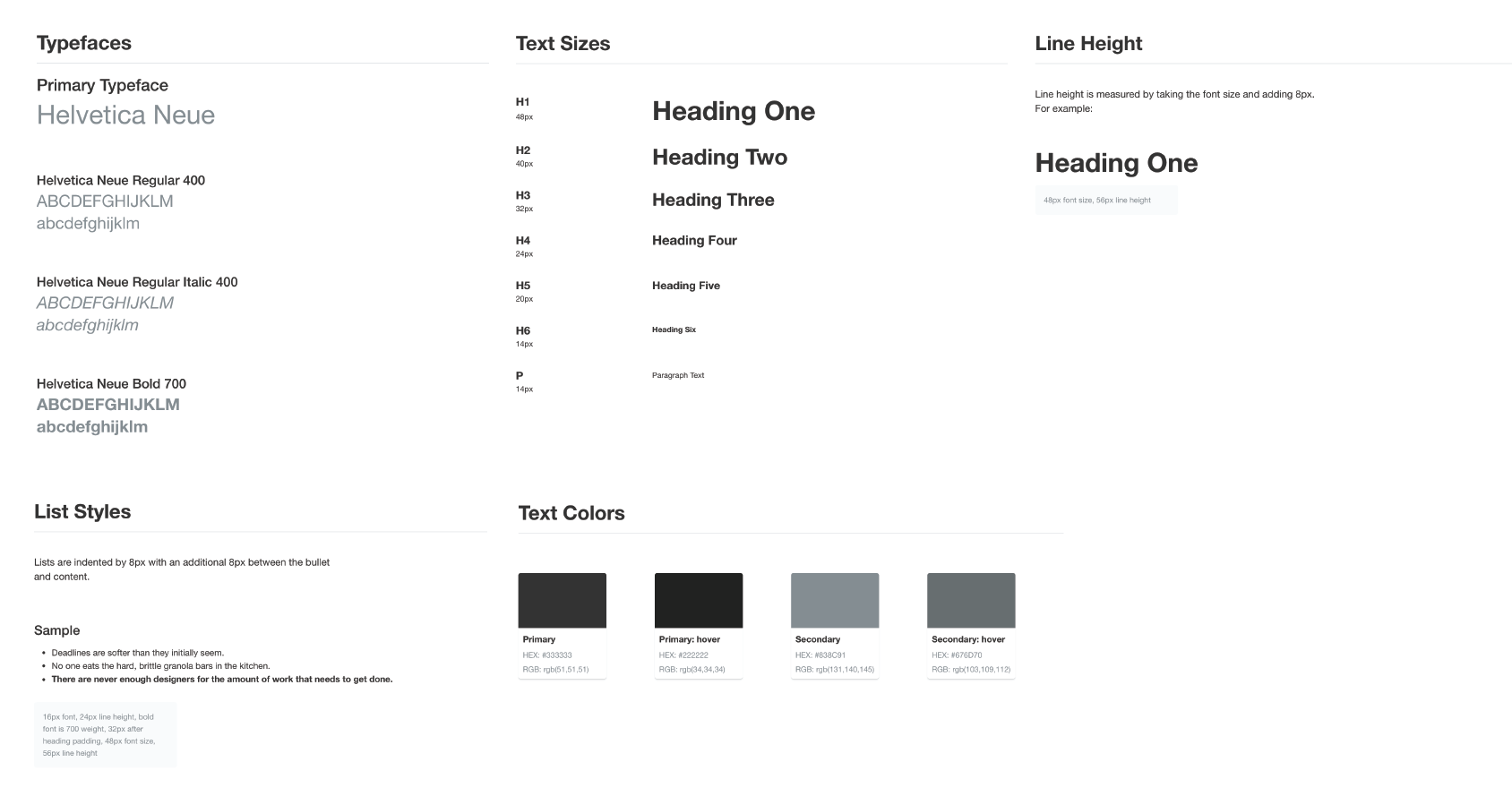
9. Create a typographic styligide
In different programs, you can create common text styles to quickly embed them, guided by the common idea of the project. It is at this stage that you need to make final corrections to typographic indicators such as color, "weight" and size. As for the color, then if you choose it, consider your palette and choose the tone that harmonizes well with it.
In the design there is a simple rule: the easier it is, the better. Moreover, this applies not only to the design, but also to the content itself - as a rule, the simpler the structure of the source text (the presence of various sorts of excerpts, titles and inserts), the easier it is to make it and as a result to program it.
